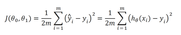
Though the equation does look daunting don’t worry we’ll go over it. Okay so the inside term is y^I – yi. y^i is basically the work function h(x). We subtract the value of h(x) from y (our actual point) for all points (that’s why we use summation). We square the expression because we eliminate any negative values. We use the 1/(2m) as simply a constant to make the math go easier.
Let’s go to a more conceptual understanding of what the hypotheses and cost function really mean. Lets first assume that in h(x) theta is = 0, so h(x) is simply (theta1)x. Now our objective is to make theta such that the difference between the points and regression line is at a minimum. If we have the points (1,1), (2,2), (3,3), and we set theta1 to 1, we get our hypotheses line to correlate with the linear line y=x. As you can see if we take our cost function, also known as the squared function error, we will get a value of 0, because all the points are on the line.
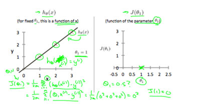
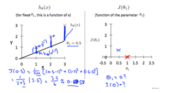
So, we create a new cost graph, and show that the cost when thetha1 = 1 is 0. If we say theta1 is 0.5 and take the squared function error to see the difference between our hypotheses and the points, we get a value of around 0.58. We then add this value to our graph.
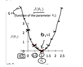
If we keep on doing this with other points, we will eventually get a graph that looks like the one below. It is cleat to see that the ideal hypothesis is at the vertex of the parabola.
Let’s now think how we could find the minimum of a two-variable equation. Let’s introduce theta back into the equation to make our hypotheses equal (theta1)x + theta. Now we have two variables how are we going to plot this? We will go to a 3-D graph for this, be aware it may look daunting but the idea behind is fairly simple.

Based on theta and theta1 the cost function J(theta, theta1) varies, shown by height of the graph. As we can see there’s a very clear minimum around 0,0,0. This graph does give a great intuitive understanding of what’s going on, but if we needed to plot multiple parameters it would get a bit messy. Therefore, we use a contour graph. Let us see two examples of these contour graphs


In the first example, if we use theta as 80 and theta one as -0.1 we get a value far away from the minimum (center of concentric ellipses). This makes sense because the line created by the algorithm is almost perpendicular to a line of best fit. In the second example the cost function of the points is a little closer to the minimum (this makes sense because the horizontal line isn’t that far off the line of best fit). And if we get to the middle of the contour graph we will see that the best fit line will be very accurate, minimizing distance between the points and the line.
Finding this point in the middle of a contour graph is what makes Machine Learning so interesting, please read the Gradient Descent article if you want to know more about a very common and effective way of “facilitating” a computer when it is undergoing unsupervised learning.
